
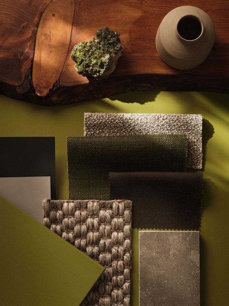
Colour drenching means taking colour beyond the four walls. Ceilings, skirting boards, doors, radiators and built-in joinery become part of the same colour story, creating a more immersive and architectural interior.
The technique can use exactly the same shade everywhere or related shades from one tonal family. The most successful schemes use finish and sheen just as carefully as colour.
What is colour drenching?
Traditional decorating often uses a coloured wall with a white ceiling and white woodwork. Colour drenching removes those visual breaks. The room can feel taller, calmer and more cohesive because architectural lines are no longer interrupted by contrasting white.
Same colour, different sheen
One of the easiest ways to make colour drenching sophisticated is to keep the colour consistent but vary the finish. Use a matt on walls and ceiling, then a subtle eggshell or satin on doors and skirting. Light catches each surface differently, so the room gains depth without introducing another hue.
Farrow & Ball Dead Flat
Dead Flat is especially useful because it is an ultra-matt multi-surface finish suitable for interior walls, woodwork and metal when properly prepared. That lets you create a very unified 2% sheen across several surfaces.
Little Greene Intelligent finishes
Little Greene makes it easy to keep one colour while changing performance and sheen. Use Intelligent Matt on walls, then move to Intelligent Eggshell or Intelligent Satin on joinery.
Paint & Paper Library Architectural Colours
Paint & Paper Library takes tonal decorating a step further. Its Architectural Colours are grouped into related families from I to V, making it easy to use a lighter version on a ceiling, a mid-tone on walls and a deeper version on woodwork.
For example, Powder I, Powder III and Powder V can create a layered room that feels coordinated without being completely monochrome.
What is double drenching?
Double drenching uses two or more related colours across multiple surfaces rather than one single shade. It can be particularly effective when a room has cornicing, panelling, alcoves or built-in furniture that you want to emphasise without creating sharp contrast.
Where colour drenching works best
- Small rooms where contrasting white trim can make the space feel fragmented.
- Hallways and staircases with strong architectural detail.
- Bedrooms where a cocooning effect is desirable.
- Living rooms with built-in shelves or cabinetry.
- Dining rooms where deeper colour can create atmosphere.
Do ceilings need to be lighter?
No. A lighter ceiling feels more conventional, but using the wall colour overhead can make the room feel more intentional and immersive. In low rooms, a continuous colour can also reduce the visual line where wall meets ceiling.
Start with samples
Large areas intensify colour. A shade used on six surfaces will feel stronger than the same colour on one feature wall, so sample generously before committing.
Shop Farrow & Ball → · Little Greene → · Paint & Paper Library →