
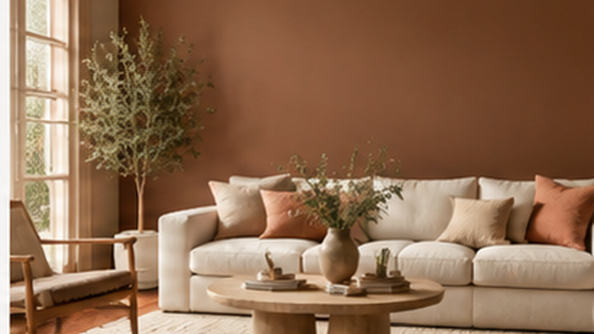
Tikkurila has revealed Heartland S483 as its Colour of the Year 2027 — a warm stone beige created to bring a grounded, balanced feel to modern interiors. Rather than behaving like a trend-led statement colour, Heartland is designed to act as a flexible foundation: calm enough for an entire room, but strong enough to support richer greens, blues, browns, reds and softer pastels.
For the 2027 Color Now collection, Tikkurila has built three distinct colour stories around Heartland S483: Solid Ground, Quiet Zone and Life Shared. Each palette starts from the same neutral base, then takes it in a different direction — earthy and natural, soft and restorative, or more expressive and social.
If you are planning a 2027 decorating project, this makes Heartland especially useful: you can begin with one dependable neutral and then decide how calm, natural or colourful you want the finished room to feel.
What colour is Tikkurila Heartland S483?
Heartland S483 sits in the warm neutral family. Tikkurila describes it as a stone-inspired beige with a natural character and a sense of stability. In practical terms, it is a useful alternative to cooler greys and very pale off-whites when you want a room to feel warmer without moving into a strongly yellow or creamy scheme.
Its strength is versatility. Heartland can work as the main wall colour in living rooms, bedrooms, hallways and open-plan spaces, while crisp whites can keep skirting boards and trim looking fresh. It can also be carried onto woodwork for a more tonal finish, or paired with darker greens, browns and blues to create stronger contrast.
At Decor Express, you can choose the Tikkurila finish that suits your surface and enter Heartland S483 as your colour choice on the product page.
Shop Tikkurila paint at Decor Express
Color Now 2027: one colour, three directions
The clever part of the 2027 collection is that Heartland does not belong to only one interior style. Tikkurila uses the shade as the common thread across three very different palettes, showing how the same neutral can feel natural, quiet or energetic depending on the colours around it.
1. Solid Ground — earthy, natural and reassuring

Solid Ground is the most nature-led of the three stories. Heartland is combined with earthy greens, browns, off-whites and carefully chosen warmer accents. The overall effect is solid and long-lasting rather than rustic.
This palette suits rooms where natural materials already play an important role — timber floors, oak furniture, stone, linen, wool and aged metals. Try Heartland across the walls, then introduce deeper shades through cabinetry, painted furniture, an alcove, panelling or a feature wall.
Colours in the Solid Ground story include Heartland S483 alongside shades such as Granulite K484, Chalet N485, Grotto M449, Sepal L447, Beeswax L396, Paper F497, Madras N411, Denim N429 and Ficus N378.
For walls and ceilings, two strong choices are Tikkurila Optiva Ceramic Super Matt 3 for a very flat, durable finish, or Tikkurila Optiva Matt 5 when you want a washable matt with a little more practicality in busy areas.
2. Quiet Zone — soft, layered and restorative

Quiet Zone takes Heartland into a softer direction. Muted mid-tones, pale neutrals, greyed pinks, blues and greens create a scheme that feels calm without becoming cold or stripped back.
This is an easy palette to use in bedrooms, home offices, reading spaces and living rooms where you want less visual noise. Instead of relying on one flat neutral throughout, Quiet Zone works by layering closely related tones so the room still has depth and interest.
The palette includes Heartland S483 with colours such as Violet Y344, Salon S478, Papyrus Y392, Halo F462, Dream X459, Silhouette L481, Indigo L429, Nephrite N494, Sea Smoke X447 and Necklace F428.
A practical way to use the look is to keep Heartland on the main walls, use a lighter shade on the ceiling, and bring one of the deeper colours into furniture, shelving or joinery. For painted woodwork, Tikkurila Helmi 10 gives a lower-sheen finish, while Tikkurila Helmi 30 gives a more traditional satin look.
3. Life Shared — warmer, brighter and more expressive

Life Shared is the most outgoing of the three palettes. It combines Heartland with warmer natural tones, fresh pastels and softened primary colours. The result is brighter and more playful, but Heartland keeps the overall scheme grounded and easy to live with.
This direction works particularly well in kitchens, dining rooms and family spaces where colour can help create energy and personality. You do not need to use every shade: Heartland can remain the main wall colour while one or two stronger colours appear on kitchen units, doors, furniture or smaller architectural details.
Life Shared includes Heartland S483 together with shades such as Sandman V431, TVT L409, Magnolia H320, Beeswax L396, Butter Milk H392, Basilica M384, Crystal G371, Tango M339, Cardinal M334, Syrup S396 and Coconut Y456.
Which Tikkurila finish should you choose for Heartland S483?
The colour is only part of the decision — the finish should match the surface and the way the room is used.
- Walls and ceilings: Optiva Ceramic Super Matt 3 for a very flat, contemporary finish, or Optiva Matt 5 for a durable washable matt.
- Bathrooms and higher-humidity areas: Tikkurila Luja 7 offers a durable matt option designed for demanding interior areas.
- Doors, skirting, furniture and interior woodwork: choose Helmi 10 for a matt appearance or Helmi 30 for a satin finish.
Using the same shade across different finishes can be particularly effective. Heartland on walls with matching woodwork creates a soft, architectural look, while changing the sheen adds enough contrast to keep the surfaces visually distinct.
How to use Heartland S483 at home
If you want a simple starting point, use Heartland as the room’s main background colour and build the rest of the scheme from there. For a restrained interior, pair it with warm whites, soft greiges and natural timber. For more depth, add olive or forest green. For a cleaner contrast, use a dark blue. And if you want a more expressive 2027 look, add muted red, yellow or pastel accents from the Life Shared palette.
As with every paint colour, lighting matters. A warm neutral can look different in north-facing and south-facing rooms, and artificial lighting will also change how the shade reads in the evening. Check the colour in the actual room before committing to a full project, and look at it at different times of day.
Why Heartland feels right for 2027
After several years of strong feature colours and cool neutrals, Heartland reflects a move towards interiors that feel more settled and adaptable. It is not trying to dominate a room. Instead, it gives you a base that can stay in place while furniture, fabrics and accent colours change around it.
That also makes the 2027 Color Now collection useful beyond a single season. Solid Ground, Quiet Zone and Life Shared show three ways to develop the same foundation, so you can keep the room calm or push it towards richer colour without having to start again from scratch.
Shop Tikkurila at Decor Express
Decor Express stocks a growing range of Tikkurila paints for walls, ceilings, woodwork, furniture and demanding interior spaces. Our tinted Tikkurila products can be mixed to your selected colour, including Heartland S483 and the wider Color Now 2027 palette.
Explore the full Tikkurila range and choose the finish that best suits your project.
Colour shown on screen is for guidance only. Screen settings, lighting and surrounding materials can all affect how a shade appears in your room.