
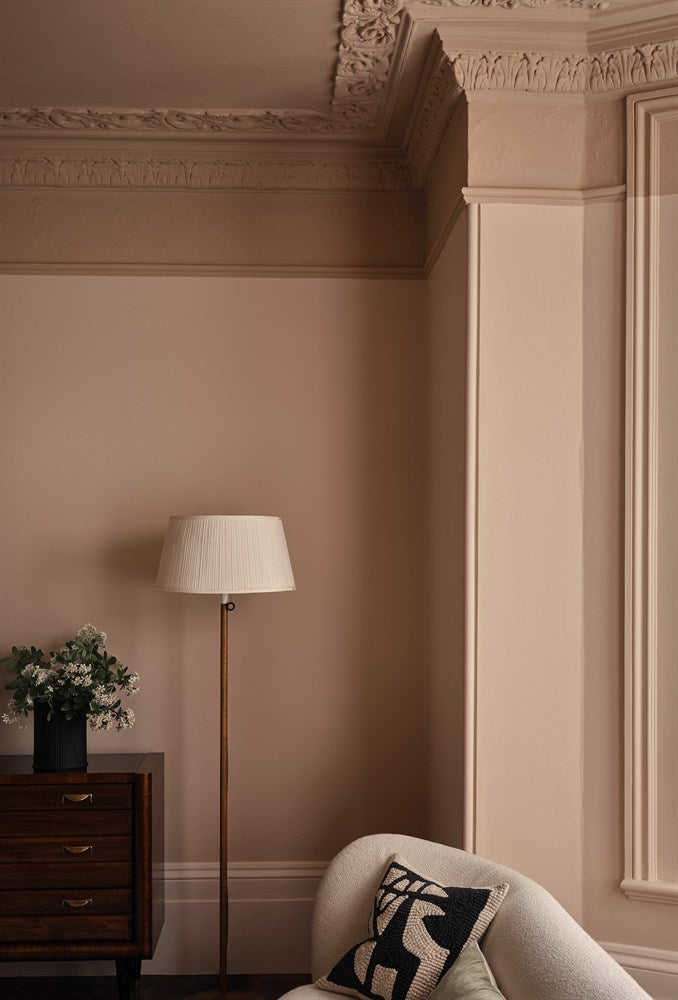
The same paint colour can look completely different in two rooms. Natural light changes undertones, depth and warmth throughout the day, which is why room orientation should influence colour choice.
Why room direction matters
North-facing rooms in the UK usually receive cooler, more indirect light. South-facing rooms receive stronger, warmer daylight for more of the day. East-facing rooms are brighter in the morning, while west-facing rooms warm up later.
This does not mean there are strict rules, but it does explain why a grey can suddenly look blue or why a warm neutral can become much creamier than expected.
Colours for north-facing rooms
In cooler north light, warm undertones can help prevent a room feeling flat. Consider warm whites, soft pink neutrals, stone tones, muted terracotta, olive and warmer greens.
Paint & Paper Library’s tonal families are particularly useful because you can compare several related depths. Powder III brings warmth without becoming sugary, while Stone families create a more neutral effect.
Little Greene colours such as French Grey can also work well where you want a neutral with more complexity than a cool modern grey.
Can you use dark colours in north-facing rooms?
Absolutely. Instead of trying to make every north-facing room feel bright, you can lean into the lower light and create a cocooning space with deep blue, green, charcoal or burgundy.
Deep shades often look especially rich in low-sheen finishes because there is less glare.
Colours for south-facing rooms
South-facing light is naturally warm, so a much wider range of colours can work. Cool blues, green-greys and cleaner neutrals often feel more balanced here because the warm daylight softens them.
If you use a warm cream or yellow-based neutral in strong southern light, expect it to appear warmer and richer at midday.
How sheen affects colour
Finish matters as well as orientation. A flat matt absorbs more light and can make colour feel deeper. Eggshell and satin reflect more light and can make the same shade appear lighter or more vivid on woodwork.
This is one reason colour drenching with different sheen levels can create subtle depth even when the paint colour itself is identical.
Test colour on more than one wall
Never judge a colour from a tiny chip alone. Test it near a window and on a wall away from the window. Check it in morning light, late afternoon and under your usual evening lighting.
Also test alongside flooring, worktops, furniture and curtains. Those surrounding colours can change how your eye interprets the paint.
A simple starting point
| Cool north light | Warm neutrals, muted pinks, earthy greens or intentionally deep colours |
| Warm south light | Cooler neutrals, blues, greens and balanced whites |
| East-facing | Test for strong morning light and cooler afternoons |
| West-facing | Expect colours to warm significantly later in the day |
Shop samples before full tins
Farrow & Ball colours → · Little Greene colours → · Paint & Paper Library colours →