Paint & Paper Library is one of the most design-led paint brands in the UK — but choosing the right colour is only half the job. The finish you select can completely change how that colour looks, how durable the surface feels and how well it performs in everyday life.
At Decor Express, we stock a wide range of Paint & Paper Library colours and finishes online, including sample pots and the brand’s premium water-based paints. Check the live product page for current pricing and any active offers.
Shop Paint & Paper Library paint at Decor Express →
Why choose Paint & Paper Library?
Paint & Paper Library is built around a simple idea: colour should work with architecture, light and proportion rather than fight against them. The result is a sophisticated palette that feels considered rather than overwhelming.
The current colour card contains 195 carefully curated colours, split between the brand’s Original Colours and Architectural Colours. The entire paint range is water-based, manufactured in the UK and formulated with low-VOC, low-odour technology.
That combination makes Paint & Paper Library particularly useful for homeowners who want premium colour but also need practical finishes for busy kitchens, hallways, bathrooms, woodwork and family spaces.
The Paint & Paper Library colour system explained
One of the biggest reasons designers return to Paint & Paper Library is the way its palette is structured.
Architectural Colours: an easier way to build a tonal scheme
The Architectural Colours are arranged into 19 tonal families, each containing five related shades numbered I to V. Shade I is the lightest and V the deepest.
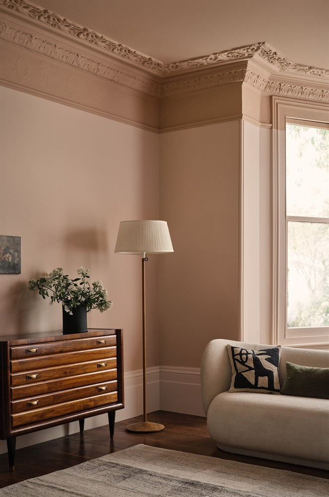
This means you can decorate a room without guessing which neutrals will work together. For example, a lighter tone can be used on ceilings, a mid-tone on walls and a deeper shade on woodwork or cabinetry, while every colour remains connected by the same underlying pigment family.
This is especially effective for colour drenching, tonal decorating and rooms with strong architectural details such as cornices, panelling, architraves or built-in cabinetry.
Explore Paper I →
Explore Stone III →
Explore Powder III →

Original Colours: more personality, stronger accents
The Original Colours provide the bolder, more individual side of the palette. These shades are designed to work on their own or alongside the Architectural Colours, which makes it easy to introduce stronger colour without losing balance.
Deep blues, greens, warm earth shades and richer accent colours are especially useful for cabinetry, feature walls, front doors and immersive rooms.
Explore Squid Ink →
Explore Midelt Sage →
Explore Cobalto →
Which Paint & Paper Library finish should you choose?
The same colour can look noticeably different depending on sheen level. Flat finishes absorb more light and appear softer and deeper, while higher-sheen finishes reflect more light and emphasise architectural detail.
Pure Flat Emulsion — the softest, chalkiest look
Best for: bedrooms, living rooms, libraries, ceilings and lower-traffic interior walls.
Pure Flat Emulsion has an exceptionally low 2% sheen, creating the most powdery, chalky finish in the Paint & Paper Library range. It is particularly effective in darker or more atmospheric colours because the low sheen allows the pigment to appear rich and velvety.
It is gently wipeable rather than designed for heavy scrubbing, so it works best in rooms where appearance matters more than maximum washability.
Architects’ Matt — our strongest all-round recommendation
Best for: living rooms, kitchens, bathrooms, hallways, children’s rooms, ceilings and high-traffic walls.
Architects’ Matt is a high-performance matt with a very low 3–5% sheen. Unlike a conventional delicate matt emulsion, it is completely washable and offers excellent scuff and stain resistance.
It can also be used on multiple surfaces, including walls, ceilings, woodwork, radiators and tiles, making it one of the easiest ways to create a seamless colour-drenched room.
If you like the look of a flat designer paint but need something practical enough for everyday family life, this is the finish we would look at first.
Architects’ Eggshell — subtle sheen with serious durability
Best for: interior and exterior woodwork, kitchen and bathroom walls, furniture, metalwork and radiators.
Architects’ Eggshell dries to a smooth 10–20% sheen, so it feels refined rather than glossy. It is fully washable, quick-drying and self-priming on suitable surfaces.
This is an excellent choice when you want woodwork to feel elegant and understated, or when you want a more durable wall finish in kitchens and bathrooms without moving to a visibly shiny paint.
Architects’ Satin — durable cabinetry and woodwork
Best for: kitchen cabinetry, doors, skirting, windows, furniture and exterior woodwork.
Architects’ Satin has a 30–35% sheen, giving it a more obvious but still controlled lustre. It is hardwearing and particularly useful for surfaces that receive regular knocks, handling and cleaning.
For kitchens, utility rooms and joinery-heavy interiors, Satin creates a durable designer finish without the stronger reflection of full gloss.
Architects’ Gloss — high impact, high sheen
Best for: front doors, statement joinery, furniture, metalwork and traditional high-gloss detailing.
With an 80% sheen, Architects’ Gloss is the most reflective finish in the range. It is water-based, durable and particularly effective when used deliberately as a contrast against matt walls.
Use it on a front door for a classic polished look, or bring it indoors on cabinetry, shelving or selected woodwork to play with the way light changes the same colour.
Architects’ A.S.P. — preparation that improves the final finish
Architects’ A.S.P. is Paint & Paper Library’s all-surface primer undercoat. It can be used on a wide variety of interior and exterior surfaces, including wood, metal, tiles, glass and building plastics.
Good preparation is one of the biggest differences between an average paint job and a professional-looking finish, particularly when moving between different surface types or applying Gloss over older coatings.
Our favourite Paint & Paper Library colour directions for 2026
1. Warm, cocooning pink neutrals
Soft pink-based neutrals are a strong choice for bedrooms, living rooms and north-facing spaces because they can introduce warmth without feeling obviously pink.
Powder III is a particularly useful mid-tone within the Powder Architectural family. Use Powder I or II on ceilings and lighter areas, then move through Powder III, IV or V for walls, woodwork and deeper accents.
2. Muted greens and natural colour
Green remains one of the easiest ways to bring colour into a room while retaining a calm, natural feel. Midelt Sage is especially versatile because it works with stone, timber, linen, warm whites and darker greens.
Try it in Architects’ Matt across walls and woodwork for a low-sheen colour-drenched look, or use a Satin or Eggshell finish on cabinetry for subtle contrast.

3. Deep blue-black for drama
Squid Ink is one of those colours that can completely change the atmosphere of a room. It works beautifully in dining rooms, studies, libraries and cabinetry schemes, and can also be used as a sophisticated alternative to black.
For maximum depth, use it in Pure Flat Emulsion. For a richer play of light, combine matt walls with Eggshell, Satin or Gloss woodwork in the same colour.

4. Layered neutrals instead of one flat white
If you usually default to white walls, Paint & Paper Library’s Architectural Colours offer an easy way to create a more sophisticated neutral scheme without making the room feel busy.
Families such as Paper and Stone let you move through a group of related tones. The result is subtle variation between ceilings, walls and trim, while the whole room still feels calm and connected.
Shop Paper I →
Shop Stone III →
5. Jewel tones for controlled impact
Stronger shades such as Cobalto can work brilliantly as smaller accents: a cabinet, island, alcove, vanity unit, front door or single architectural feature.
Pair saturated colour with a softer Architectural neutral to stop the scheme becoming visually heavy.
The easiest way to choose: room by room
| Area | Recommended finish | Why |
|---|---|---|
| Living room | Pure Flat or Architects’ Matt | Soft premium look; Architects’ Matt adds washability |
| Bedroom | Pure Flat | Ultra-low sheen and rich depth of colour |
| Hallway | Architects’ Matt | Washable and resistant to scuffs and stains |
| Kitchen walls | Architects’ Matt or Eggshell | Durable, washable and practical |
| Kitchen cabinets | Architects’ Satin | Hardwearing with a refined satin sheen |
| Bathroom | Architects’ Matt or Eggshell | Suitable for humid, high-use spaces |
| Woodwork | Eggshell, Satin or Gloss | Choose sheen depending on the look and durability required |
| Front door | Matt, Eggshell, Satin or Gloss | Paint & Paper Library’s Architects’ finishes allow different sheen effects outdoors |
Why sample pots are worth it
Colour changes dramatically with daylight, room orientation, surrounding flooring and artificial lighting. A shade that looks warm in a south-facing room can appear cooler in a north-facing space.
Before ordering full-size tins, test your favourite colour on more than one wall and look at it morning, afternoon and evening. Sample pots are particularly useful when comparing close Architectural shades such as I, II and III within the same colour family.
Paint & Paper Library sample sizes are available on many colours. Check the live product page for current sizes and pricing.
Browse all Paint & Paper Library colours →
Shop Paint & Paper Library at Decor Express
Prices and promotions can change by finish and size, so use the live collection and product pages for the current Decor Express price before ordering.
Check current Paint & Paper Library prices →
Why buy Paint & Paper Library from Decor Express?
Choosing premium paint online is easier when the retailer understands not just the brand, but the practical difference between finishes.
Decor Express stocks Paint & Paper Library online and through our London stores in Clapham and Richmond. Our team can help with colour choice, finish selection, project quantities and compatible preparation products before you order.
Whether you are refreshing one room or specifying a complete house, you can shop by colour, then choose the finish and size that best suits your project.
Shop Paint & Paper Library Paint →
Frequently asked questions
Is Paint & Paper Library paint water-based?
Yes. Paint & Paper Library’s current paint range is water-based, with low-odour and low-VOC formulations across the range.
What is the difference between Pure Flat Emulsion and Architects’ Matt?
Pure Flat Emulsion has the lowest sheen at around 2% and gives the softest, chalkiest appearance. Architects’ Matt has a similarly flat look at around 3–5% sheen but adds much greater washability, scuff resistance and multi-surface versatility.
Which Paint & Paper Library paint is best for a kitchen?
Architects’ Matt is an excellent choice for washable kitchen walls. Architects’ Eggshell also works well where extra durability is useful, while Architects’ Satin is particularly suitable for cabinetry and joinery.
Can Architects’ Matt be used on woodwork?
Yes. Paint & Paper Library positions Architects’ Matt as a multi-surface finish suitable for walls, ceilings, woodwork, radiators and tiles, which makes it useful for low-sheen colour drenching.
What is the best Paint & Paper Library finish for a front door?
It depends on the desired sheen. Architects’ Matt gives a flat contemporary look, Eggshell a low sheen, Satin a smooth mid-sheen and Gloss a traditional high-shine finish.
How many Paint & Paper Library colours are available?
The current Paint & Paper Library colour card contains 195 colours, including Original Colours and the structured Architectural Colours palette.
Start with colour. Finish with the right paint.
The strength of Paint & Paper Library is that colour and finish work together. You can build a subtle tonal room using the Architectural Colours, introduce a stronger Original Colour as an accent, or carry one shade across walls, woodwork and cabinetry while changing only the sheen.
That flexibility makes the brand especially well suited to modern decorating: sophisticated colour, practical water-based finishes and enough choice to tailor every surface to the room.
Ready to choose your colour?
Shop all Paint & Paper Library Paint at Decor Express →
Looking for pattern as well as colour? Explore Paint & Paper Library Wallpapers →