
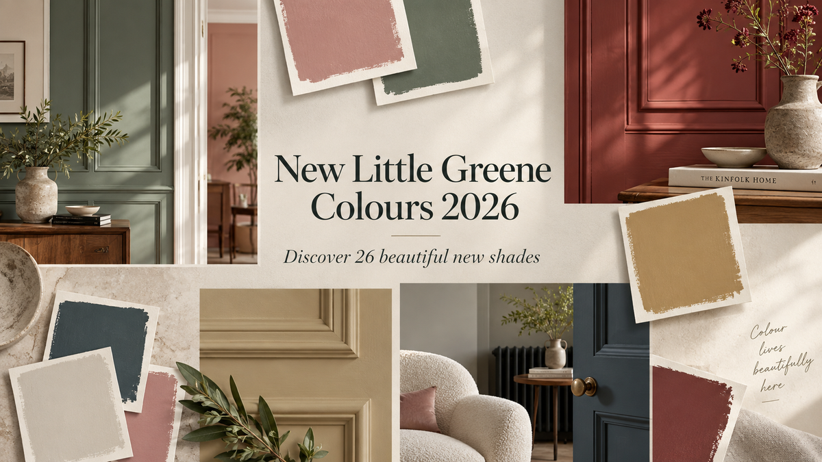
Little Greene has refreshed its much-loved Colours of England palette for September 2026, introducing 26 new paint colours that bring even more choice to one of Britain’s most distinctive designer paint collections. The update combines five individual new shades with carefully considered additions to Little Greene’s tonal Colour Scales, making it easier to build layered, coordinated schemes throughout the home.
From warm off-whites and delicate pinks to earthy yellows, architectural greens and deep, atmospheric blues, the new collection has been designed to work beautifully in both classic and contemporary interiors. Below, explore every new Little Greene colour, discover where it works best and click any shade or colour image to view the product at Decor Express.

Five New Little Greene Colours for 2026
Haye White 346

A warm, highly versatile off-white with an ochre-based character, Haye White 346 is an elegant alternative to a stark brilliant white. Its gentle warmth makes it particularly useful in north-facing rooms and for soft, seamless schemes across walls, ceilings and woodwork.
Parlour 347

Parlour 347 is a soft, pink-tinged off-white inspired by historic colour at Dyrham Park. Warm without feeling overtly pink, it works beautifully in kitchens, dining rooms and relaxed living spaces alongside deeper reds, muted greens and natural timber.
Perpetual Blue 348

Deeper and stronger than Celestial Blue, Perpetual Blue 348 balances blue, green and grey to create a calm but confident colour. It is a particularly beautiful choice for bedrooms, home offices and sophisticated colour-drenched rooms.
Floss 349

Fresh, playful and easy to live with, Floss 349 is a lighter interpretation of Little Greene’s Carmine. It brings warmth without becoming sugary and pairs especially well with warm whites, chocolate browns and rich burgundy tones.
Ashes of Marigold 350

For an earthy, sophisticated take on ochre, Ashes of Marigold 350 offers a muted, brown-toned character with a grounded heritage feel. It looks particularly effective on kitchen cabinetry, joinery and feature walls.
New Hammock Colour Scale
The established Hammock colour is now supported by three tonal companions, giving decorators a ready-made family for layered neutral schemes.
Hammock - Pale 351

Hammock - Pale 351 is the lightest addition to the family: soft, understated and ideal where you want a warm neutral that feels gentler than white.
Hammock - Mid 352

Hammock - Mid 352 brings subtle definition to walls, panelling and joinery and combines naturally with Hammock - Pale for gentle tonal contrast.
Hammock - Dark 353

Hammock - Dark 353 is the richest tonal anchor in the scale, making it an elegant choice for doors, skirting, cabinetry and architectural details.

Warm Pinks, Browns and Earthy Yellows
Flight Pink 354

A beautifully muted, brown-based pink, Flight Pink 354 has the softness of a neutral with enough colour to feel distinctive. It works wonderfully in bedrooms, living rooms and layered schemes with warm neutrals.
Marle 355

Marle 355 is a warm, muted brown that pairs naturally with wood, stone, linen and other tactile materials, bridging traditional neutrals and richer brown interiors.
Elysian Yellow 356

Elysian Yellow 356 is a refined, gold-toned earthy yellow that adds warmth without the intensity of a bright primary shade. It looks especially beautiful with rich greens and warm whites.
Brûlée 357

Warm and caramel-like, Brûlée 357 is an inviting yellow with a softened, earthy quality and enough depth for colour drenching or statement joinery.
The New Barge Stone Colour Family
Barge Stone introduces a versatile neutral family with a gentle green undertone. Its four tonal strengths can be combined across walls, ceilings and woodwork for a sophisticated, coordinated interior.
Barge Stone - Pale 358 is a delicate, green-leaning neutral that creates a calm, airy foundation on walls and ceilings where pure white might feel too sharp.
Barge Stone - Mid 359

Barge Stone - Mid 359 adds more body while retaining the family’s quiet natural quality, ideal for subtle zoning, panelling and woodwork.
Barge Stone 360

The core shade, Barge Stone 360, is a balanced neutral with a restrained green undertone and provides an elegant backdrop for natural materials, muted blues and stronger green accents.
Barge Stone - Dark 361

Barge Stone - Dark 361 brings greater depth to the scale and is ideal for doors, cabinetry and lower wall sections.
Oilcloth 362

For a stronger green companion, Oilcloth 362 provides a rich grounding note on cabinetry, doors and woodwork, particularly with the softer Barge Stone tones.

Cooler Neutrals and the Celestial Blue Scale
Cobble 363

Cobble 363 is a soft grey with a subtle green undertone and a slightly cooler feel than French Grey, making it a natural partner for calm blue schemes.
Celestial Blue - Pale 364

Celestial Blue - Pale 364 is a light, gentle blue that creates a fresh but restful backdrop for bedrooms, bathrooms and ceilings.
Celestial Blue - Mid 365

With more presence but the same serene character, Celestial Blue - Mid 365 is a versatile wall colour for living rooms, bedrooms and hallways.
Celestial Blue - Deep 366

Celestial Blue - Deep 366 adds richness and contrast to joinery, cabinetry, feature walls and full tonal blue schemes.
Rome 367

Deep, atmospheric and subtly green, Rome 367 is a confident blue for dramatic living rooms, libraries, colour-drenched spaces and exterior details.

The Expanded Boxington Green Scale
Three new tonal versions extend Little Greene’s Boxington family, offering a simple way to introduce graduated greens across adjoining rooms, walls and architectural details.
Boxington - Pale 368

Boxington - Pale 368 is the softest expression of the family, bringing a light green wash to walls and ceilings without a strong colour statement.
Boxington - Mid 369

Boxington - Mid 369 provides a balanced middle tone for walls, panelling and joinery and works beautifully with both paler and deeper Boxington shades.
Boxington - Deep 370

Rich yet connected to the softer tones, Boxington - Deep 370 is ideal for cabinetry, doors, panelling and feature areas.
Hillside 371

Warm and yellow-leaning, Hillside 371 has natural warmth that suits kitchens, garden rooms and living spaces, especially alongside timber, stone and warm neutral paints.
How to Choose Your New Little Greene Colour
Paint colour changes with natural and artificial light, so we always recommend testing your shortlisted shades in the room before committing to a full scheme. View samples at different times of day and consider how the colour works with flooring, furniture, worktops and existing finishes.
The new tonal families are particularly useful if you want a coordinated interior without matching every surface exactly. Try a paler shade on walls or ceilings, a mid tone on panelling and a deeper companion on doors, skirting or cabinetry. This creates depth while keeping the palette harmonious.
Explore the complete Little Greene paint collection at Decor Express and discover the right colour and finish for your next decorating project.
Colour references and historical inspiration courtesy of Little Greene Paint Company. Screen colours can vary; always test a physical paint sample in your own space before ordering larger quantities.